Local People
Local People is an app based service that connects local service providers and local customers, offering an easy-to-use platform for appointment scheduling and management, secure payment and trustworthy reviews. Developed by the lovely people at Combine.ai, we were able to use their developed technology for automatic calendar scheduling.
ROLES
UX Design
UI Design
Brand Design

Product Sprint
To start the project, we ran a product sprint, quickly iterating an interactive prototype that was tested in a workshop format with project stakeholders and customers. It quickly became evident that to satisfy the providers and customers, we would need to create two interfaces.
The client interface geared towards service acquisition and the vendor interface focussed on scheduling and job management. Key to defining the information requirements was identifying what was required from a client to build enough trust to engage with a vendor that would be coming to their home. This varied depending on age group, technical expertise and employment status.
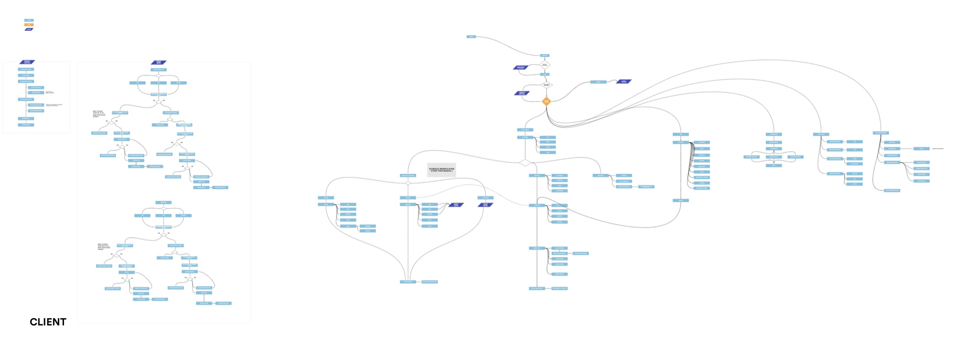
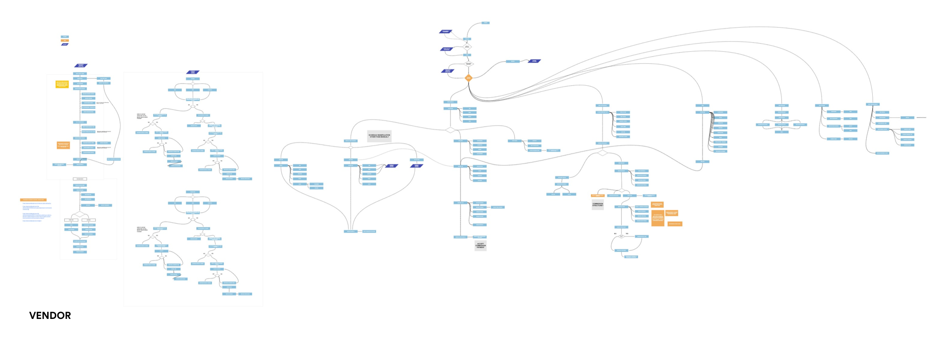
Wireframing
After fully defining the information requirements, I created two prototypes, Vendor and Client. Both were tested with their potential customer groups, allowing us to refine the experience. I created the wireframes using a modular approach, allowing assets to be used across both apps.


Brand Creation
In parallel to the UX process, I ran a Brand Immersion workshop, and from the results of that a naming exercise. In what is already a crowded space, we had to strike a balance between being descriptive and distinct: Clients were not receptive to more modern app naming conventions, and vendors preferred the ‘Ronseal’ approach. ‘Local People’ tested well and I created a logotype and brand palette that, while distinctive, would not alienate either audience.


UI Design
With a large volume of content presented, I opted for friendly, highly legible type with exceptionally strong titling, giving significant visual contrast within the app. Colour was applied minimally in order to maximise accessibility.


