Within
Within is a premium health coach, unique in the market for its ability to combine fitness, nutrition and mindfulness practices with user data and machine learning to create bespoke ongoing programmes that truly benefit users in all walks of life.
The app creates a holistic approach to healthier living by creating habitual change across the 3 key pillars of healthy living, Movement, Eating and Thinking. It uses data input by the user alongside data generated from wearable technology to create reactive activity programming.
ROLES
UX Design
UI Design
Product Management
Generation 1
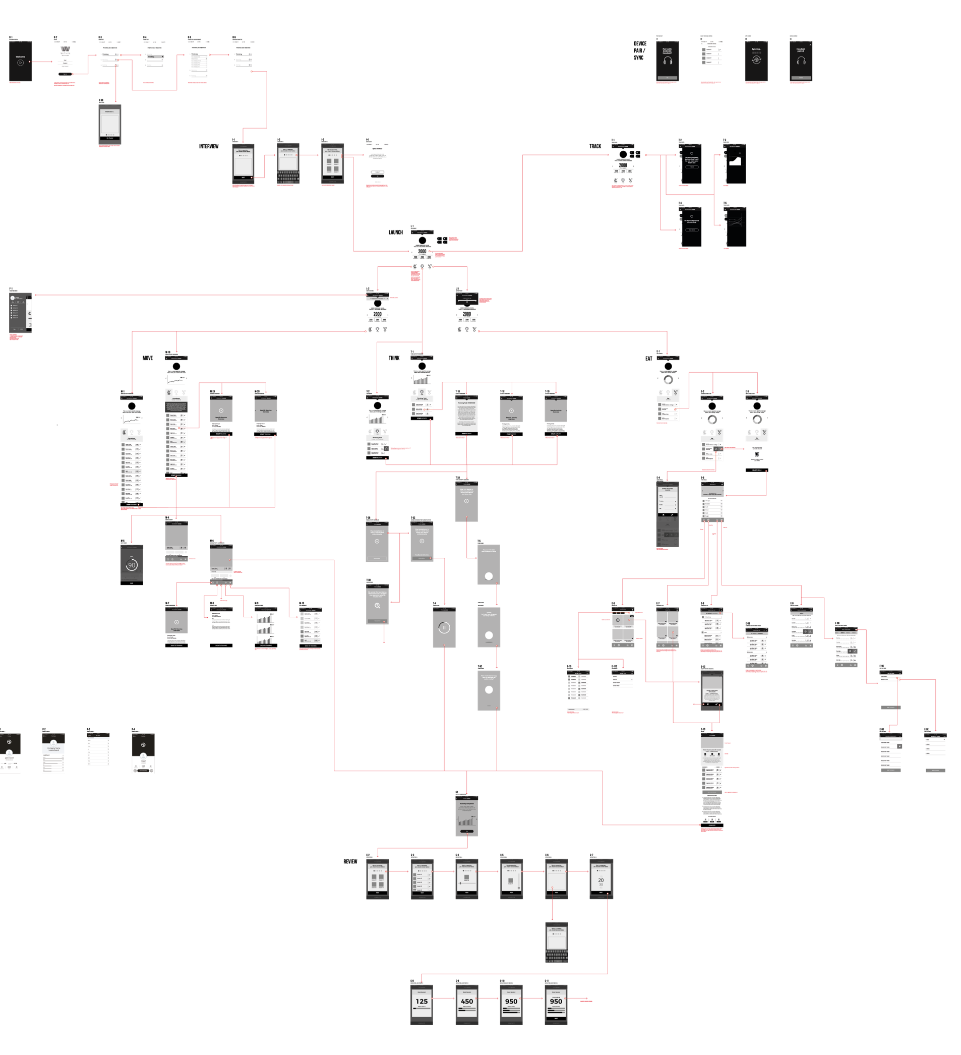
After a series of stakeholder workshops and an immersion session, I created a low fidelity prototype for review, and to define content requirements. With three specific activity types, two pieces of hardware required to take objective readings, and a the need for some method of centralised and clearly understandable scoring mechanism, the biggest challenge was to keep the number of user interactions as low as possible.
UI Design
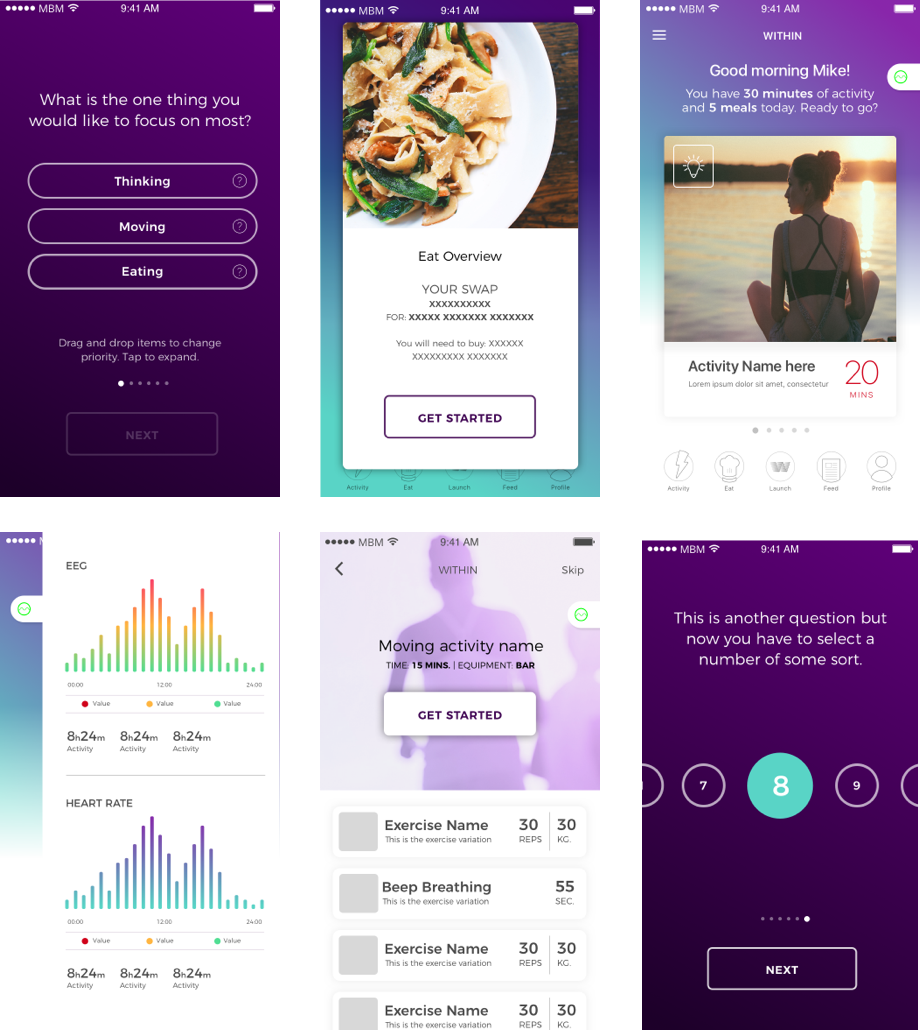
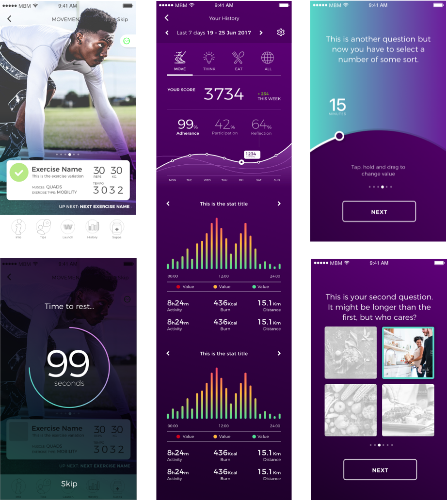
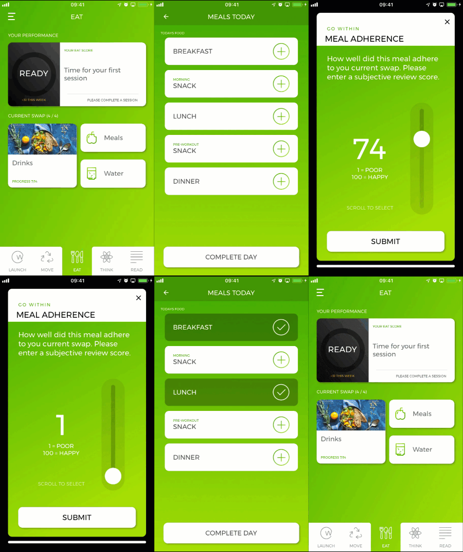
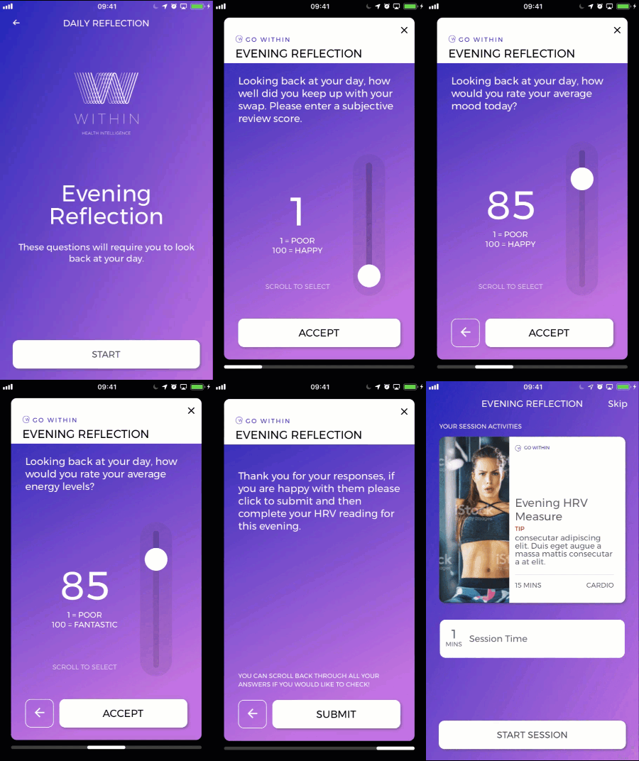
I created an interface based on established company branding and tested this with our core audience while working with the development team to validate their technical approach.
Generation 2
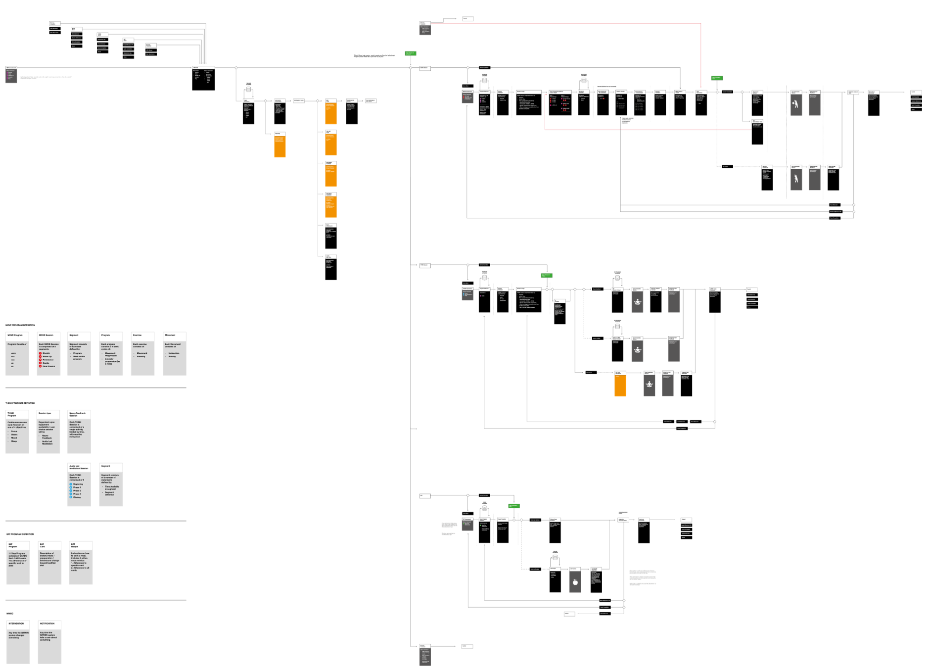
Initial showed that while individual sections of the app worked as intended, the overall experience was unwieldy, and not conducive to long term adherence. I worked with each subject matter expert to integrate the programmes (and data input) more closely. After a significant change in technical approach, alongside the further development of the training programmes, I was able to streamline the user flow significantly, reducing the time a user was required use the app, and reducing the resource required for the development.
UI Design
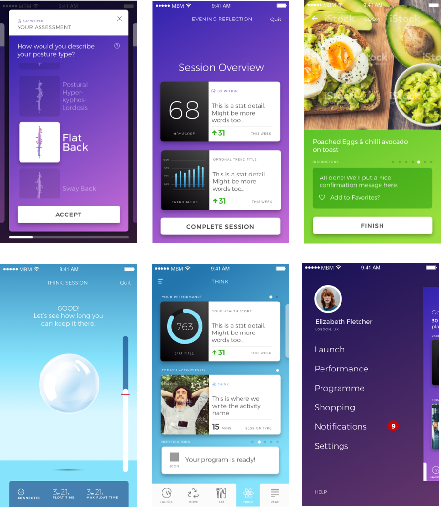
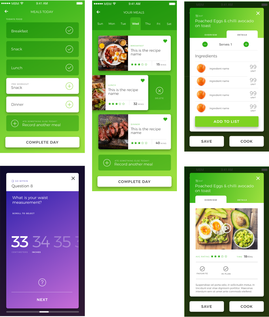
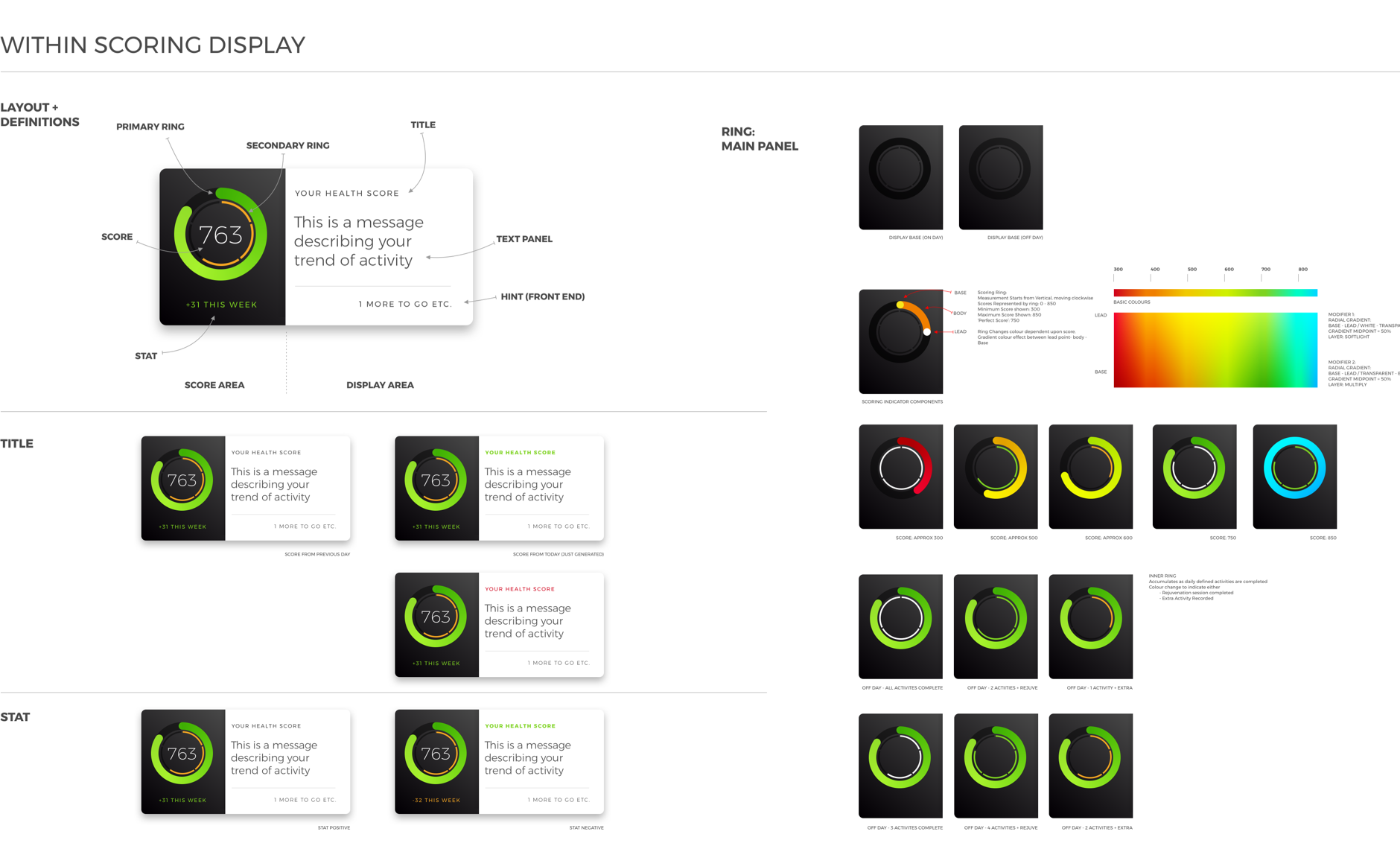
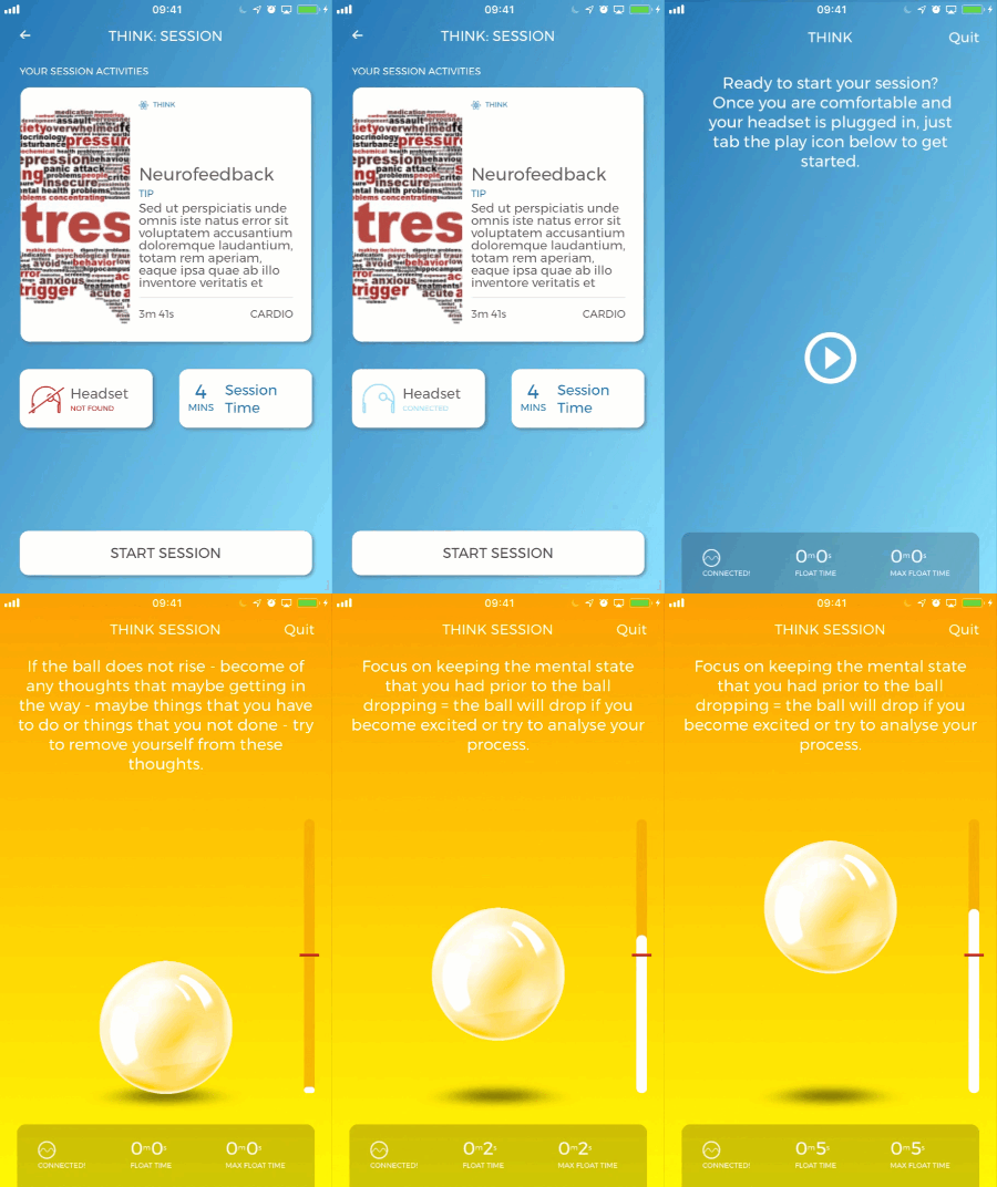
After feedback from our testers, I updated the brand palette significantly – with such a complex approach, a more primary palette allowed for easier navigation. I also created the daily scoring mechanism and its’ presentation, representing a daily ‘Credit Score’ for a user’s progress. In parallel, I managed the creation of training plan content: videos for exercise, photography for the recipe provision and audio recordings for the mindfulness activity.
Generation 3
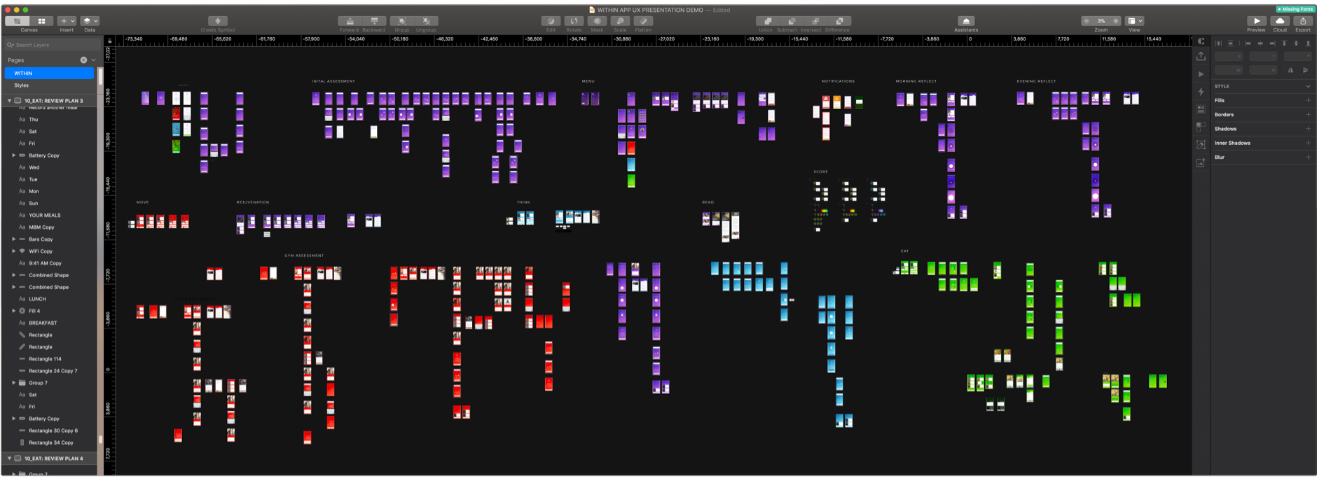
We ran a 6-week alpha test, a time period long enough to detect individual changes as a result of the health programming supplied, with 30 people. The feedback allowed us to refine the programming further, which meant that I could further refine the UX. I reduced the app page count by 50% and reduced the number of components within the component library. Testing with users returned favourable results as they preferred the speedier interactions, and did not mind that they needed to dig deeper for certain information.
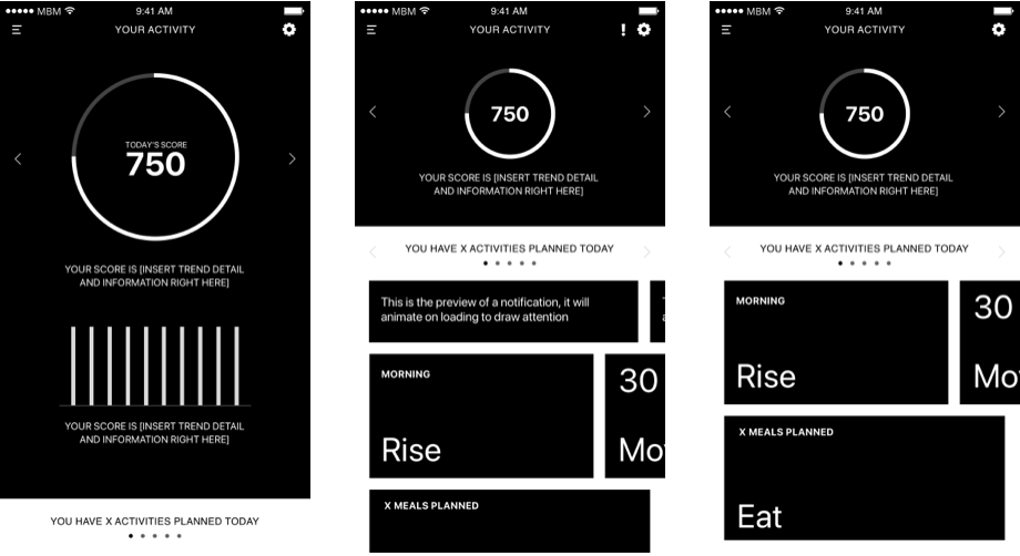
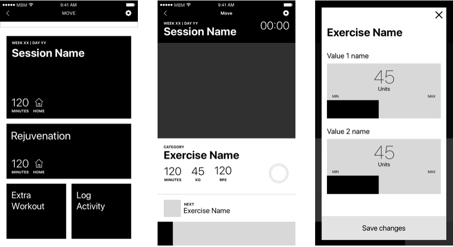

Streamlining the UX meant that we could reduce the density of information presented in individual screens, leaving room for us to start using animation to provide a more natural user experience.
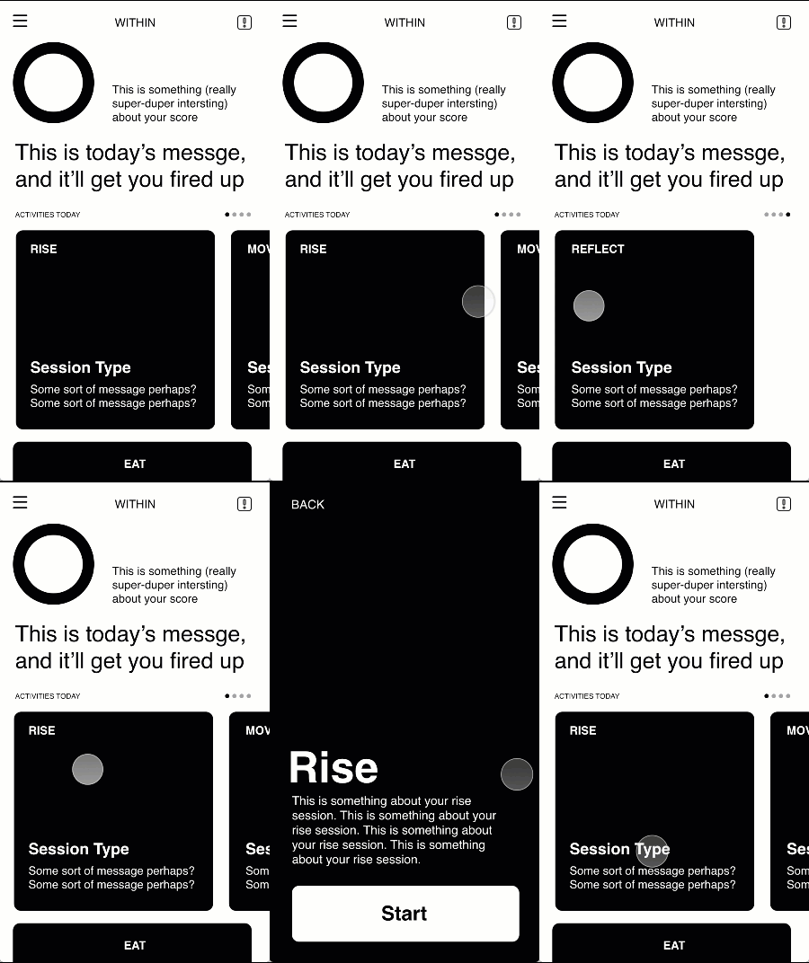
Each of the five primary activity types were made accessible via a single swipe, reducing the number of actions required to navigate by 50%, and providing a clear priority for the user to take action.
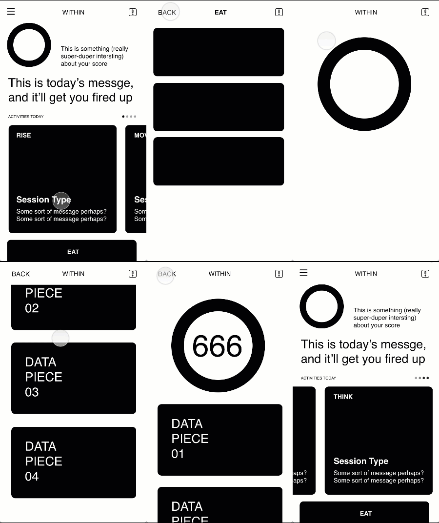
User data was made accessible by a single click from the main dashboard, allowing the users to understand their progress much more quickly.

We added visual environments and soundscapes to the Think game, allowing a clear separation between the activity objectives - Stress Reduction or Focus.